Landing pages are magical. They can mean the difference between a successful campaign and a miserable flop. Before you can effectively tap into that magic, it is important to understand the difference between a website and a landing page and to consider landing page optimization. By way of explanation let’s look at a recent campaign I ran where conversion on the dedicated landing page was 27x higher than conversion on the website over the same time period.
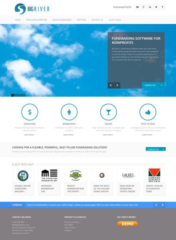
First of all, there is no doubt that your website is important. It is designed to appeal to a broad audience and has a lot of different functions. On my website, for example, I want to make sure visitors are aware of all the various products and services we offer. I need a place for current clients to login. I need a place for the blog, (which shares advice and fundraising tips in case you’re interested). I need a place for potential partners to see how we work with other companies in our industry.

That’s all good stuff, but it means there are a lot of different paths a visitor might take once she gets to my site. And if you asked me what I wanted a visitor to the site to do, I would have to answer, “That depends.” I want prospective clients to “Schedule a Demo”. I want potential partners to “Contact Us”. I want blog readers to “Subscribe”.
For my website, this is OK.
However, when I send an email campaign or pay for online advertising, I should never be driving traffic back to my homepage. Why? When I send a specific message, with a specific call to action, I want to be sure to steer recipients down a clear path to a specific response.
I don’t want them to get distracted.
I don’t want my message diluted.
Let’s look at a recent campaign I ran as an example.
Situation: We introduced a product to support nonprofit raffles. I wanted to generate leads that I knew would be interested in hearing about this new product. To be clear, I didn’t want them to buy the product; I just wanted to gather leads to whom I could sell the product later.
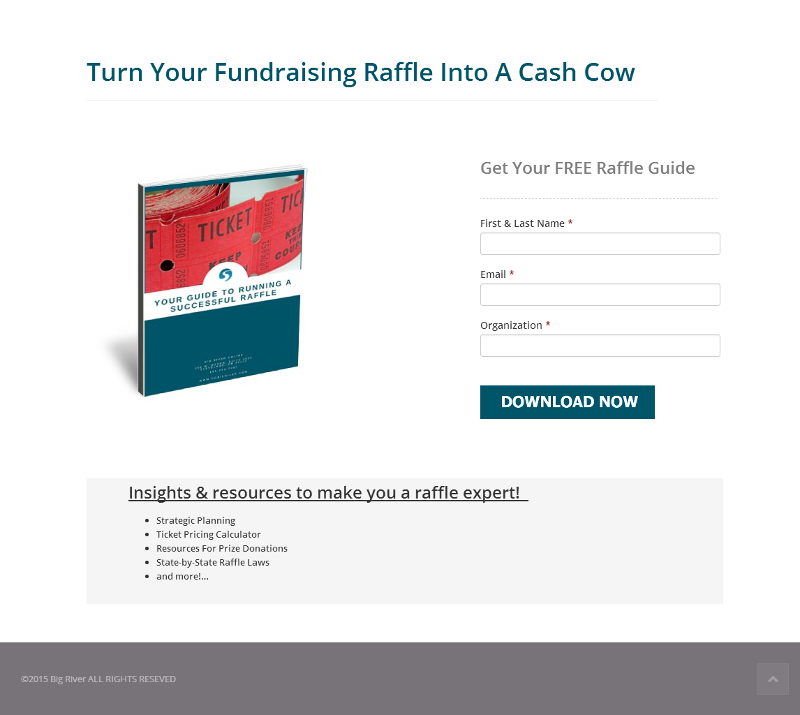
Call to Action: “Download Your Guide to Running A Successful Raffle”. I know that nobody wants to give their contact information away, so I had to offer something of value and I had to know that those who gave me their information were interested, specifically, in running a raffle. So, I created a Raffle Guide containing ideas, best practices and resources to help nonprofits put on successful raffles.
Message: I planned to send emails and use Google Ads to promote my Raffle Guide.
Destination: I could have driven traffic to the Raffle product page on my website and included a form to download the guide. But consider the various distractions: a visitor could decide he wanted to check out the blog, or browse other products, or scroll through our social media feeds. None of those actions would help me meet my explicit goal of generating raffle leads.
So I created a landing page. It is simple. It has one call to action and one button. (This is the magic trick!)

You see this approach all the time in eCommerce. Why? Because it works! So let’s see how the same approach applies to nonprofit organizations.
Nonprofit websites are often like a company page. They have to have broad appeal and house content that is relevant to a variety of visitors:
- Educate visitors about your mission
- Give visitors a way to sign up for services
- Share information about upcoming events
- Share recent news / headlines
- Provide bios for key staff members
- Let donors know the various ways in which they can support you
- Show potential members the value of membership and give them a way to join
- Recognize individual and corporate donors
- The list goes on…
Now, think about the digital messages you send out into the world: email appeals, eNewsletters, social media posts, paid advertising
Do you have specific actions you want constituents to take in response to these communications?
Give a $25 donation
Give $1 / day
Opt-in to your newsletter
Sign a petition
Register for an event
Buy a raffle ticket
For each of the specific calls to action that you make, create a dedicated landing page. Ideally, the same donor commerce tool you use for donations, events, etc. on your web page will allow you to easily create transactional landing pages. If not, consider augmenting your tools with a platform that will give you these capabilities. As you design your landing pages, keep these basic guidelines in mind:
- Use the same language on your landing page that you do in your message
- Remove distractions (navigation links)
- Have one clear CTA
- Enable the visitor to answer the call to action right there on the landing page
- Keep forms short
The exercise required to identify the one clear CTA and construct a page designed to accomplish one particluar thing will help you think more precisely about goals and target audience. And you will undoubtedly see better results!
For more examples and information about landing page effectiveness:
http://www.searchenginejournal.com/5-valuable-lessons-expertly-designed-ppc-landing-pages/126771/
http://thelandingpagecourse.com/landing-page-101-intro/
Want to see how easy it can be to create a transactional landing page?
