Fundraisers know the power of storytelling. They know how critical it is to share with donors the impact of every gift. They know that thank yous should be heartfelt and personal. They know that they need to inspire donors to engage on social media.
And yet so many donate pages do not show what we know.
I am convinced it is because fundraisers do not know how technology can help them create a better donor experience. There are A LOT of elements that can be examined and optimized to create the ideal donor experience. For the purposes of a bite-sized blog post, let’s look at three of them:
1. Presentation of donation amounts.
2. Thank you email / receipt.
3. Social sharing prompts.
In an effort to demonstrate, let’s look at two scenarios. The first is a typical donate page experience. The second offers a more personal and powerful experience.
TYPICAL DONATE PAGE EXPERIENCE
Websites may have different glossy images. Buttons may be different colors, but most “good” donate pages offer an experience like this:
1. Select your donation amount:
In a best-case scenario, donation amounts are listed from highest to lowest and a specific giving amount is suggested to the donor by being pre-selected. As excited as a donor might be about your organization, there is nothing here that is engaging or inpiring. When a donor selects an amount it’s just cash moving from her account to yours.

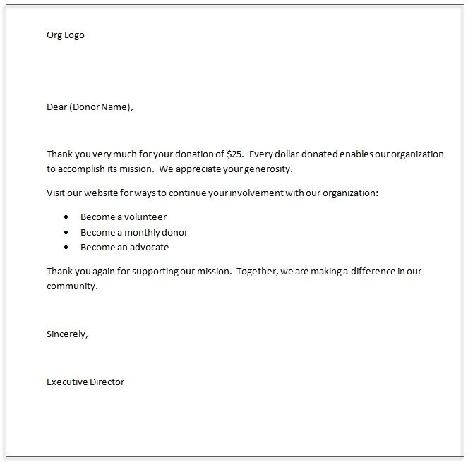
2. Get a thank you / receipt email:
Many organizations add a paragraph about their accomplishments or a paragraph about their mission. Even so, most thank you emails are really just receipts. They are dry. They are boring. They are impersonal.

3. (Maybe) Share something on social media.
Most organizations now have social buttons on their pages that enable visitors to follow them on Facebook, Twitter, Instagram, etc. But what about after a donor makes a contribution to the organization and wants to announce her support for you on social media? Often there will be a timid share prompt on the page that looks something like this.

If there is pre-configured content in the posts, it is often a generic blurb about the organization or its mission with links back to the organization’s home page.
PERSONALIZED DONATE PAGE EXPERIENCE
It is possible to create a more personal, powerful, effective experience just by tweaking the three familiar elements of a typical donation experience.
1. Select the impact you want to have:
Shift the “Select Donation Amount” to empower the donor to choose the impact that she wants to have. Now, instead of dropping cash into your organization’s bucket, a donor feels connected to the recipient who will get a new pair of shoes because of her generosity. It’s specific. It’s a story. Just by presenting donation amounts this way, you enable a donor to say “I gave a child a new pair of shoes today.”

2. Get a celebration of your generosity.
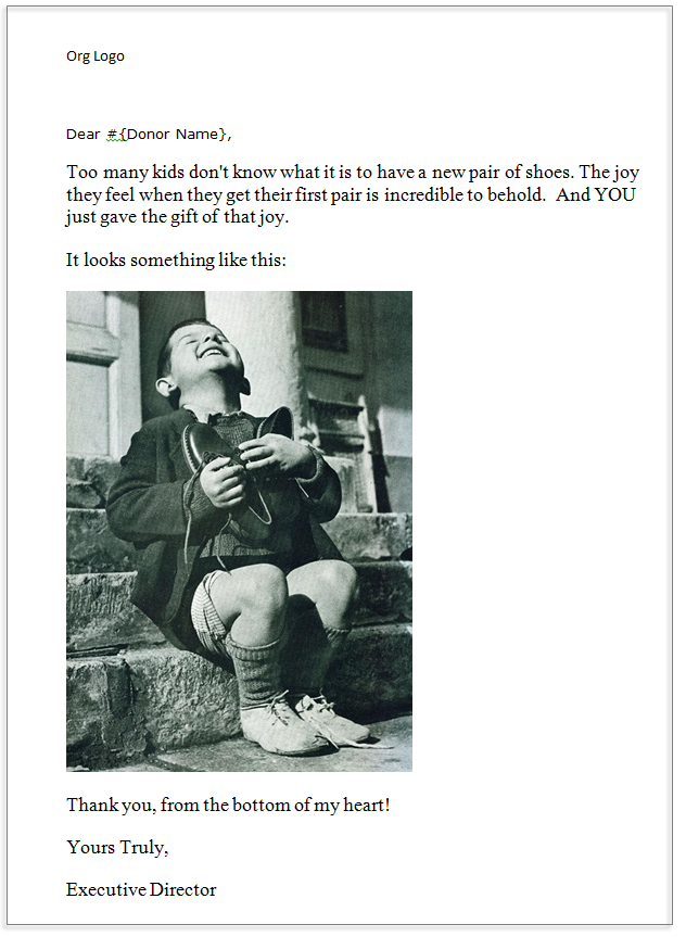
Some donor commerce platforms (ahem…Big River) enable your organization to construct a different thank you for each giving level. This is exciting! It means that the email/receipt doesn’t have to be a generic form letter. Instead you can send a very specific and heartfelt thanks. You can continue the story that began when the donor selected the change she wants to see in her community.

3. Share a great story
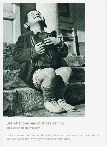
When a donor has a story to tell, she will be excited to share it on social media. And that is really good for your fundraising efforts because it is a testimonial for your organization and free promotion to people who might not be familiar with you or your mission. First, set up the donation experience so you create a story for the donor and then actively ask your donor to share it. That’s important! Don’t just passively position social sharing buttons on your pages.
TIP: If you are using Big River, you can configure social media content that populates with a different story depending up on what your donor gave so the social share is personally relevant to the donor and therefore more likely to be shared. You can also specify the link to which users will be directed if they click through the post, so you can take them to a landing page specifically designed to convert based on that appeal.

Posts are pre-populated with your content and link back to the donate page so those who respond can quickly support you.

Start thinking about how you can strategically and systematically personalize the experience that your donors have with you online. See what the tools you have at your disposal will support. If your current online program just enables donors to give you money online, think about how you can do more; inspire donors to have a real impact on a cause they care about and make themselves part of a story they’ll want to share far and wide.
If you want to learn more about how Big River can help you do that, we’d love to hear from you! CONTACT US today for a demo.