I went looking for great donation pages designed with an audience in mind and featuring well-packaged asks. Here are a few of the best I found.
OXFAM
Audience: Those who want to help eliminate poverty and care for the environment.
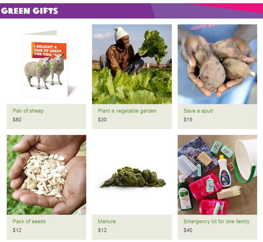
This catalog features items that promote sustainable and environmentally friendly aid. Note the array of suggested donation amounts ($80 – $12) with the highest donation amount identified first. I love the large images, the hands full of healthy, homegrown food. I love the man grinning in his bountiful garden. The images really draw a viewer in. (I’m not keen on the manure picture, but I guess if you’re going to go green you can’t be squeamish.)
COVENANT HOUSE
Audience: Those who want to provide aid to impoverished children.
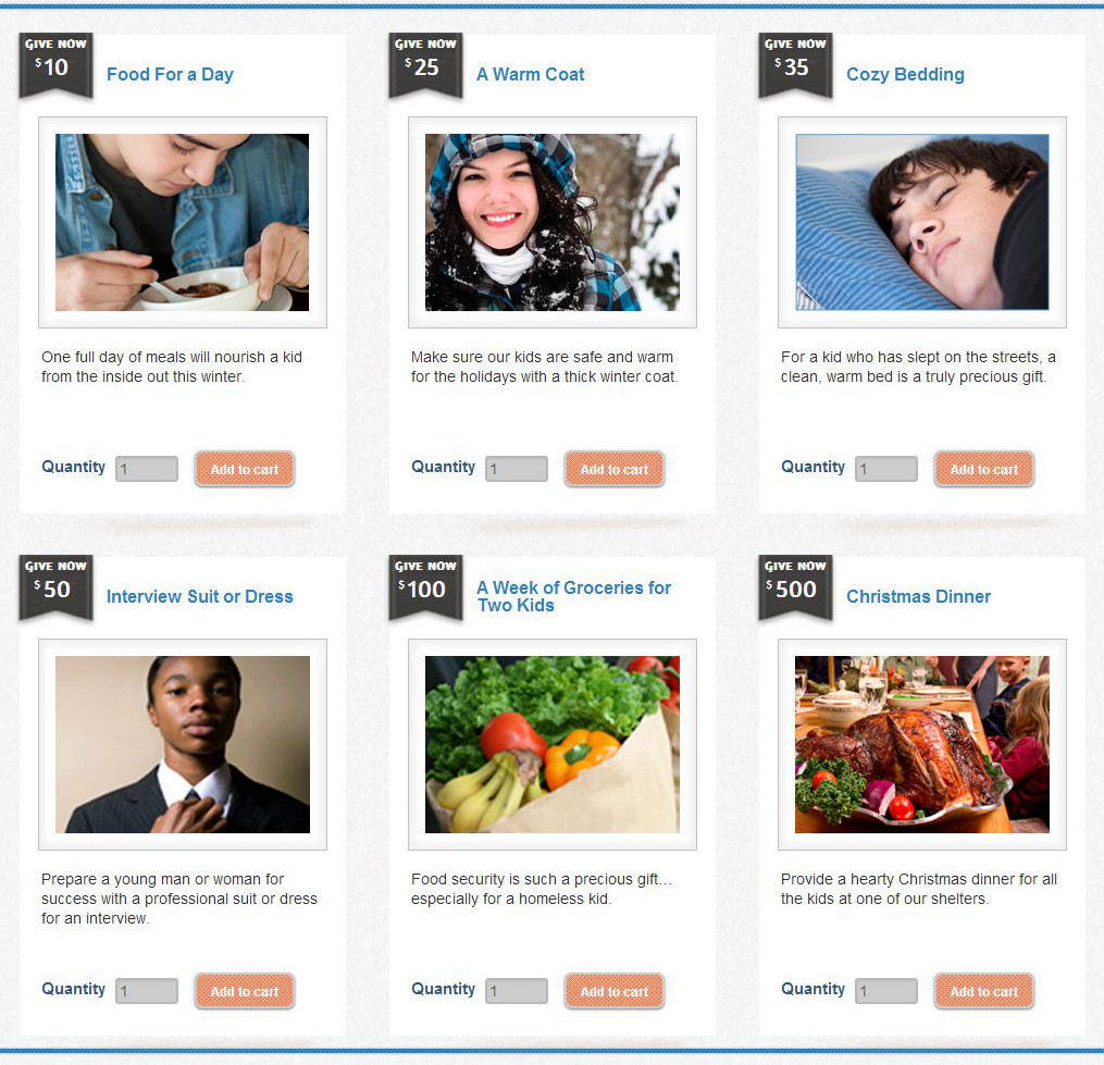
Almost every image depicts a child or young person and great descriptions help a donor see the impact of the gift. What donor wouldn’t feel good thinking that his donation is not just $35, but a “cozy” clean bed for a child who has been on the streets?
WORLD VISION
Audience: This particular page targets donors who are concerned about global poverty and see education as a means to provide people with brighter futures.
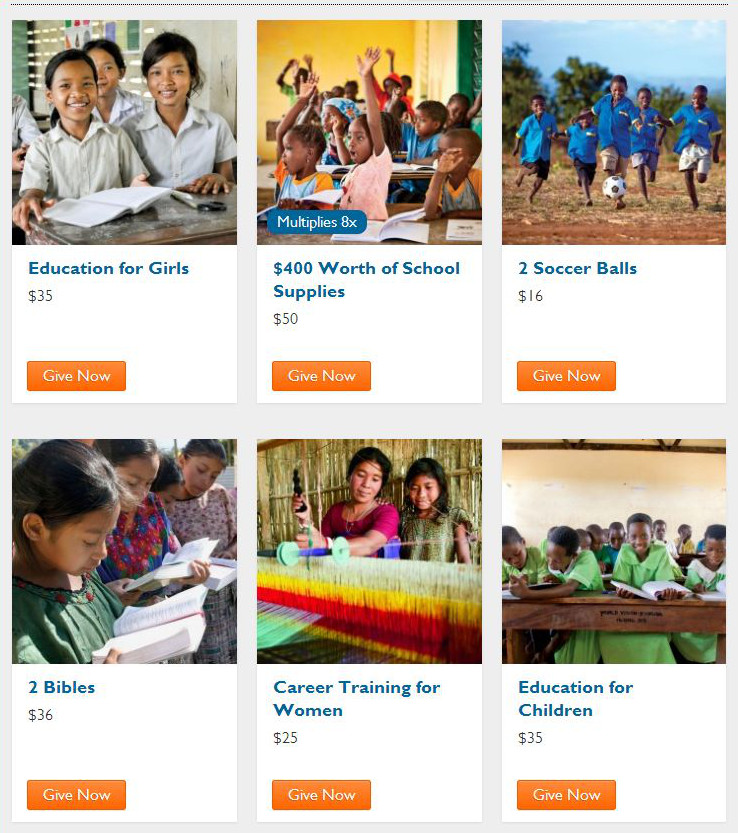
Again a large, beautiful picture is associated with each donation. Kids are depicted as engaged, healthy, & happy to be learning. If you know that a donor values education, and you present donation levels that demonstrate clear impact, donors are apt to give more and feel more connected to your organization and its mission.
Good donation pages start with good donor segmentation. In each of these three examples, the organization knows who their donors are and why they lend support. For a quick tutorial and downloadable worksheet that will help you identify your donors, CLICK HERE.
Have a good grasp of who your donors are, but need a little structure to help you package your donation items, check out A Fundraiser’s Guide to Donation Packaging.


